Sunday 30 September 2012

Harry Potter 7 Scene Analysis


Harry Potter and the deathly hallows part 2 is a movie which was released in 2011; it is the last in the Harry Potter series, and concludes with the final war between the wizards and the death eaters.

The main lighting in this scene is dark, there is a lot of dull colours used on the other characters. The dark colours are used to connote the darkness about to happen. In the scene we see Harry Potter die and the colours connote the bad things about to happen. We see that the scene is set is the forest at night. We see that the faces of the background actors are dark, as they are not the main characters in the scene we see that the light is not focused on their faces.

The lighting used to both Harry Potter and Voldermort is filter lighting which connotes the realism during the scene it also puts the audience at the edge of their seats. We see the light focused on the faces of the main actors; which connotes their importance in this scene. Low key lighting is used to show the contrast between the light and dark areas where the light is focused on Voldermorts face as he is the villain and its also faced on Harry's face but he is the protagonist. The high key lighting is also shown to make the actors look more realistic in the dimly lit scene but hardly any shadows are created.

Still image Analysis


'The Dark Knight' is a 2008 action - thriller movie; which is a sequel to the film 'Batman Begins'. Where the Batman fights the Joker throughout the movie.

The movie poster uses a low angle shot and also Low key lighting which connotes  the protagonists body to stand out and inspire fear;  the dark background connotes the idea of fear. It has also be done to add height to the protagonist.The audience is psychologically dominated by the figure on the poster. The light behind the protagonist not only shows a contrast between the actors two personality's but it also shows that the audience can have hope with the hero.  

The Back Lighting is used in the poster which makes the light from behind the actor to stand out which creates a silhouette. The scenery behind the actor connotes destruction and not only does the blue/grey background create a fearful effect the light is focused on the actor.It also shows the dominant character of the protagonist. Even with the dark background the character still stands out with his black costume. Which is helped by the light behind him

Saturday 22 September 2012

Print Advert Analysis


The new Liverpool F.C advert is purely to promote the new Liverpool F.C shirt; we can see that it is a low angle shot and this has been done to  add height of the object to make it inspire fear and insecurity in the viewer, who is psychologically dominated by the figure on the screen. 
The dark background again connotes this idea of fear that everyone else should have and the myth does not say anything about having fear of a football team but the it re-writes history which may be the aim of the football team. The tagline as the top of the advert is written in a typography of red; which connotes danger and the bloody type font also puts fear into the viewer again.

The bright lights on each player may be there to give the viewer a glimpse of hope against the fear, and the size of each player shows how big they are and the influence they could have. The angry expression on the face also connotes to the audience that the players do not have any fear; it also addresses people who support the football team and seeing as the team have got a new sponsor, the new tagline and the new sponsor connote the fact that they are here to do stuff differently. 


The target audience for the new LFC shirt advert is mostly aimed at males who range from the age of 7-60 and the audience is drawn to the advert by the aggressive faces of the players, by using the top players of the football team they show their confidence in the players. We can also tell that the protagonist is the Captain 'Steven Gerrard'. The colours used in the advert are dark and stand out in the background, the dark colours connote the darkness of the players and the different sides of the players. The tagline 'We come not to play' connotes the fear factor again. The use of the lighter colours on the players stand out on the page therefore; the audience knows that we can trust the players. 


The image is framed due to there not being a lot going on in the background, this draws more attention to the tagline and the players used in the advert, the players have been shown to us as 'Warriors' which is the main approach of the advert and the expressions on the faces of the players shows this. The type of shot is a low angle shot which is taken from the bottom, this shot has a large effect on the audience as it inspires fear through out the audience as they can see the emotion in the players face and in there eyes. The players pose in the image connote strength and power.


The subject matter of this advert is to advertise the new LFC Away shirt. The subject matter is the new shirt but it could also be the players as they are there to promote it to the target audience and as children and teenagers dream to be like football players; they want to be wearing whatever their idol might be wearing week in, week out. The setting of the advert is a dark skyish background which gives a strong confident look to the players and with the players faces also being a bit pale; it also shows fear inside the players but as they are 'Warriors' , they are facing their fears. 


The dark shirts of the players are to show the darker side of the players and not only is the advert conveying the idea of fear it is also promoting the shirts to its target audience who want to be like their football players, and as Warrior is a brand mostly known in America; the promotion of a big football team can help them worldwide. 


Tuesday 18 September 2012

Media Consumption

Newspapers

The daily newspapers I read is the metro; and the reasons I read the metro is for the sports section. My interest in sports and football results in me reading the Metro daily and finding out
about gossip on football and even interviews from football players and managers.

Magazines
Magazines are something that don't appeal to me; as a kid I used to read football magazines like 'Match', and I used to read this every week but as I grew up I stopped reading it, I used to buy it every week. The demand for print was dying and as I found out I could see the same thing on the internet I stopped reading magazines.
Television
On a weekly basis I watch television around 20 hours a week; and I usually start watching it after 6pm due to Eastenders being on and on a weekday football is usually on at night. The programmes I enjoy watching are sports shows,movies and eastenders. As I am the only boy in the family I usually watch football alone but I sit down with my family to watch Eastenders.

Cinema
In the last month I went to go see Ted in the cinemas. I usually watch movies through either netfilx or on Sky movies and sometimes even through anytime+ where I can download movies straight to my sky box. I usually watch the movies with my sister and we both decide on a movie to watch.

Internet
I see myself going on the internet daily, I access the internet at home and even at school during break through my phone. The main sites I use via the internet is social networking sites and bbc to check the news.

Radio
I hardly saw myself listening to the radio; when I am in the car and the footballs on I used to listen to it through bbc five live but as the application for Sky Go came out, I realised that I could watch the football through my phone and other website showed the football so the demand for Radio dyed out for me.

Wednesday 12 September 2012

Analyse of the opening scenes in Kidulthood


The first five minutes of Kidulthood give the audience a negative view of how society see's the youth.The film is opened with modern music throughout the start which begins to fade when the actors begin to speak. At the beginning the two main girls in the first few minutes are shown as scruffy, and disrespectful due to the fact that their ties are undone and both are wearing big gold earrings; therefore stereotypes them as looking as a 'hood-rat' and 'chavy'. The way they both talk also shows the audience on where it is set (London). The school is the only location shown in the first few minutes, with majority of the actors wearing scruffy school uniform.

Also there is a fight in the first 5 minutes which points out the way the characters are, due to this we can tell that the movie is going to be of a violent genre. A lot of close ups are used when the fights are taking place and both fights are shown at the same time. We can tell that the urban film would appeal to a young audience due to the violence, the sexual content at the beginning and also the use of swear words. To conclude we can tell that the director is trying to show the what the youth are like and even though the movie appeals to the youth, it also gives other target audiences an insight on what the youth are like and how they could be different to how society see's them.


Tuesday 11 September 2012

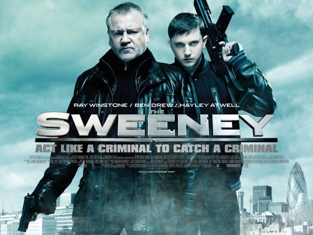
The Sweeney film poster analysis


'The Sweeney' movie poster is aimed to promote the release of the new Ray Winstone and Ben Drew movie.

Firstly, the sweeny is an adaption of the actual tv show which was made in the 70s,
the use of colours on the advert is a contrast of light blue and white; the use of these colours show the background as the sky and with the dark grey clouds, it connotes that there might be something bad that happens during the movie. Also the colour divide shows a sense of danger. On the other hand the use of the light blue colours may connote that there is going to a rivalry between the charcthers. The use of the lighter colours connote the change of power between two parties.

Also the way Ray Winstone and Ben Drew stand symblolises that they are ready for a war, and the poses also show us that this is going to be an action movie. The guns also give us an insight about what might happen in the film.

The title and the slogan are in the centre of the poster and this emphaises the importance of the title, and appeals to the audience. Also the way Ray Winstone is positioned in front of Ben Drew shows that Winstone is the hero/protaginist during the movie. The use of the weapons and the clothes they are wearing links to the action genre, we can tell that it will involve violence and maybe even gang violence, from the clothes they are wearing we can tell that they are not police officers and they may be disguised as gang members, the slogan "Act like a criminal to catch a criminal" shows use that we will see two sides of the characthers, it also tells us that they are police officers.


To conclude, the characthers are infront of the London skyline so it tells us where the movie will be, the faces of the charcthers tell us that they will me manipluative, also the seriousness also links to the action genre, the shots are medium shots while both Winstone and Drew are in action poses .  This also connotes that the meidum shots are there to relate to the action genre of the movie. . As well as this, there is use of a mise en scene as the clothes worn by the characters link to the genre of action,as they are baggy dark clothes; so it shows the darker side to them.Similarly, the facial expressions shown by the characters connote the idea of the characters being angry, tense and ready for action.

Friday 7 September 2012

Why I choose As Media

Why I choose As Media and What I hope to achieve in it. 

The reason why I choose As Media was due to the fact that my sister done it and she recommended it to me, I also choose A Level Media is because I had an interest in Movie's and it also fitted in well with my subjects. In the future I want to study Law at University and by speaking to Mr.Bush I found out that university's see A level Media as a good subject. In the near future I hope to achieve a good grade in media so it can help me study law in University and not only this but it can help me learn new skills for example; different techniques on how to do video shooting and even different ways to analyse text's. It also helps develop a critical awareness and understanding of media, it's role in society and the way the audience and responds to it. At the same time it also gives me a choice to work in media related area, and also access to a wide range of careers. It can also help me develop my skills in media production with the focus on cameras and editing.